9 Best Alumni Websites & How to Drive Engagement with Yours
Your university’s alumni are vital members of your community, and they need a place to go when they have questions about resources, events, and ways to give back—that’s where alumni websites come in.
These websites aren’t just online hubs for your alumni community, they’re also valuable tools for boosting alumni engagement and retaining donors. If you’re creating an alumni website for the first time or looking for improvement ideas, the best place to start is other successful websites. In this guide, we’ll explore:
- Essential Alumni Website Features
- 9 Best Alumni Websites to Get Inspired By
- Alumni Website Design Tips
As we analyze the best alumni websites, we’ll also touch on key strategies you can use to boost website engagement, from telling alumni stories to promoting matching gifts. Let’s get started by covering the essential features every alumni website needs.
Essential Alumni Website Features
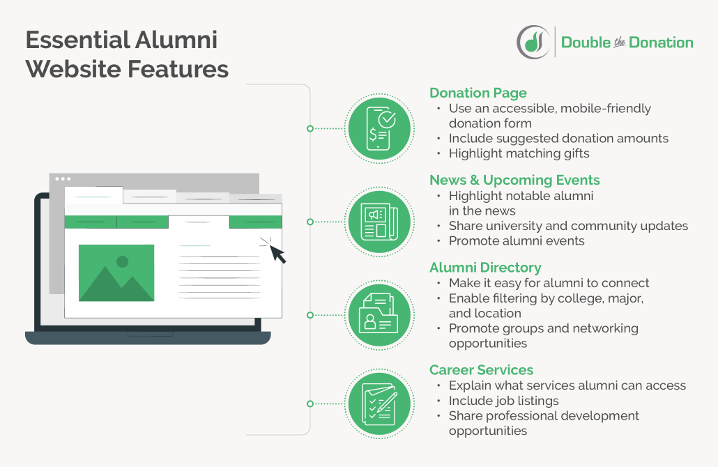
Just like your main university website must address the needs of prospective students, parents, donors, and current students, your alumni website should feature everything your alumni may need or want to explore. This makes it essential to have clear navigation to the most important pages and information alumni will be looking for.
For most universities, this includes:
- A donation page. Alumni who love their alma mater and want to give back to current and future students should be able to easily find your donation page. Make sure there’s a prominent link or button leading to your donation page in your website’s navigation bar. On the page itself, include a mobile-friendly donation form, suggested donation amounts, and information about how to request a matching gift for your university.
- News and upcoming events. Engage visitors by regularly highlighting news stories about notable alumni, sharing important university updates, and promoting alumni events. You may do this by creating specific pages or blog categories for news and events. Or, highlight them on your homepage by adding a calendar widget or a rolling carousel of blog posts.
- An alumni directory. One of the main reasons alumni visit your website is to network with other alumni in their field. Make it easy for alumni to connect by creating a password-protected alumni directory and hosting it on your website. In the directory itself, enable filtering by college, major, and location. You can also use this page to promote alumni groups and networking opportunities to those looking to connect.
- Career services information. Resources and career services that alumni can access should be front and center on your alumni website. Create a page that includes instructions for accessing career services, job listings, and professional development opportunities, then include the page in your site’s navigation bar.
In addition to these essentials, your alumni website should provide other ways for alumni to engage with your university, such as by volunteering or attending school sporting events. If you’re not sure which aspects to focus on, use tools like Google Analytics to analyze the engagement activity on your site and find out which pages alumni visit the most.
9 Best Alumni Websites to Get Inspired By
Now, let’s take a look at a few top alumni website examples and discuss what you can learn from them to improve your own website.
1. Princeton
Princeton’s alumni website is a masterclass in spotlighting alumni news, stories, and events. Right from the homepage, visitors can read the stories of four different notable alumni and feel immediately connected to the Princeton alumni community. As you scroll through the page, you’ll find information about upcoming events to join, university news to catch up on, and a fundraising campaign you can donate to.
Best of all, the Princeton alumni website includes numerous clear calls to action (CTAs) that invite alumni visitors to register for events, watch videos, volunteer, and connect with the community.
2. Washington University in St. Louis
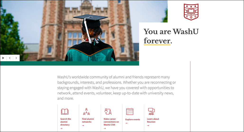
When alumni visit Washington University in St. Louis’s alumni website, they’re greeted with the empowering, welcoming message: “You are WashU forever.” This homepage immediately makes alumni feel at home and takes them back to their days at their alma mater, boosting the chances that they stay on the page and engage with the website.
Directly below this message, five clear CTAs introduce user pathways addressing the main reasons alumni visit the website—to access the directory, find alumni networks, explore events, or learn about upcoming reunions. By honing in on these user motivations and speaking to them right away, this website empowers alumni to find what they’re looking for quickly.
3. California Institute of Technology
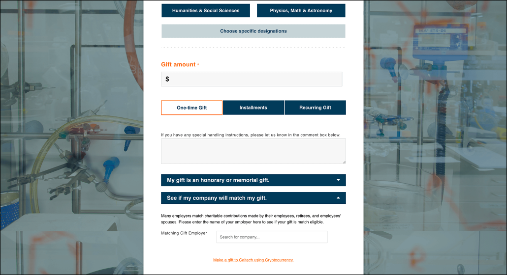
One of the highlights of the California Institute of Technology alumni website is its donation page. The form allows alumni to choose from a variety of departments and scholarship programs to support with their donation, and then provides multiple giving options so alumni can choose the donation method that’s most convenient for them.
Specifically, CalTech’s donation page includes a matching gift search tool that alumni can use to find out if they’re eligible for employee giving programs. The donation page also lets alumni designate honorees for their gifts and even donate cryptocurrency.
4. Morehouse College
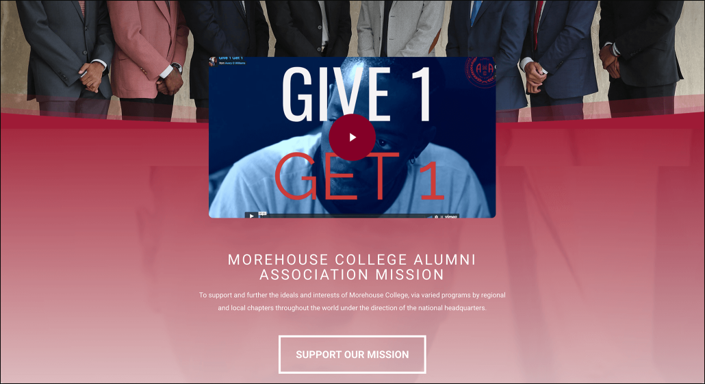
The website for Morehouse College’s alumni association exemplifies the power of video storytelling to connect with alumni and encourage donations.
On its homepage, this alumni website features a video about the association’s “Give 1 Get 1” fundraising campaign. The video follows a student in need of tuition assistance and several alumni who each donate $100 and call one other person to do the same until the student’s bill is paid. This empowering video is followed by a large CTA button that encourages alumni to support their mission and give back just like those in the video.
5. Rhode Island School of Design
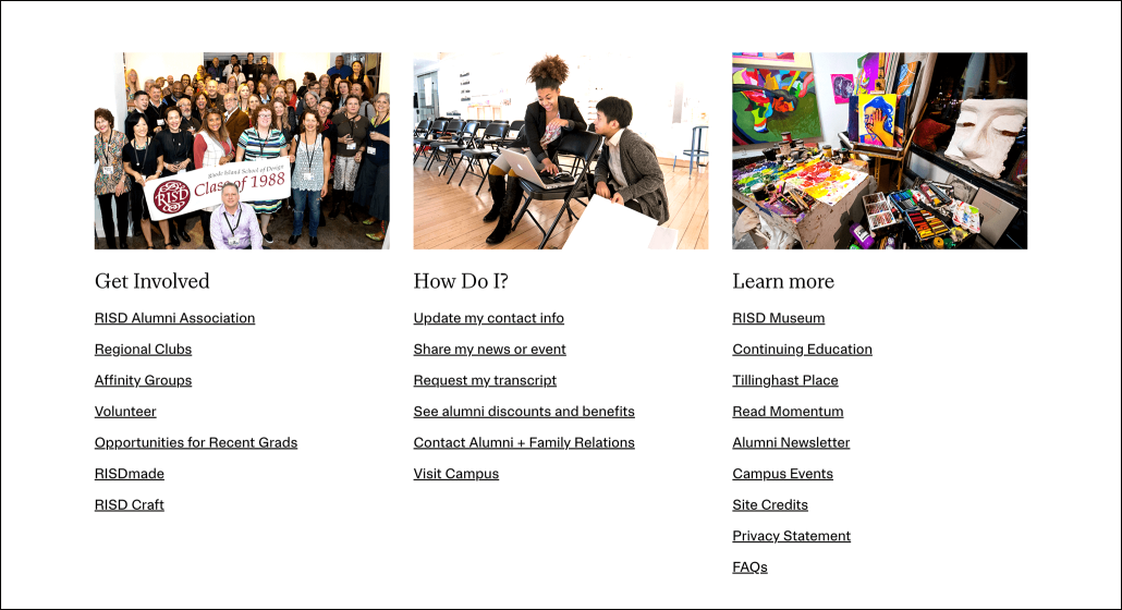
The Rhode Island School of Design (RISD) makes the best alumni websites list thanks to the clear, comprehensive user pathways on its homepage. The website divides actions users might want to take into three categories: Get Involved, How Do I?, and Learn More. Each section then includes links alumni can follow to go right to their desired destination.
6. Vassar College
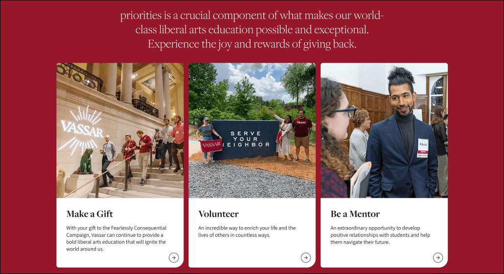
Look to Vassar College’s alumni website if you need inspiration on how to encourage alumni to get more involved. On this website’s homepage, it features three prominent ways to give back: Make a Gift, Volunteer, and Be a Mentor. Each one is paired with a compelling image, a short blurb about why alumni should give back, and a link to get started.
7. Stanford University
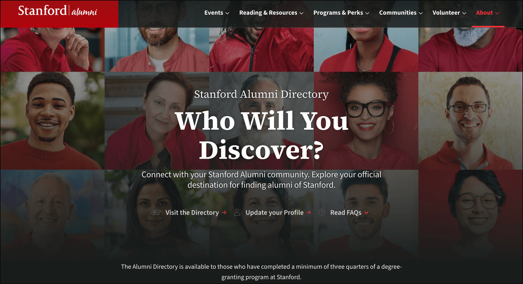
Every alumni website should include a directory that alumni can use to find their peers and network with community members. Stanford’s alumni directory is especially compelling since it features a backdrop of alumni headshots, emphasizing the breadth and diversity of Stanford’s alumni community. It also includes three links users can follow to visit the directory, update their profile, and explore FAQs.
8. Brandeis University
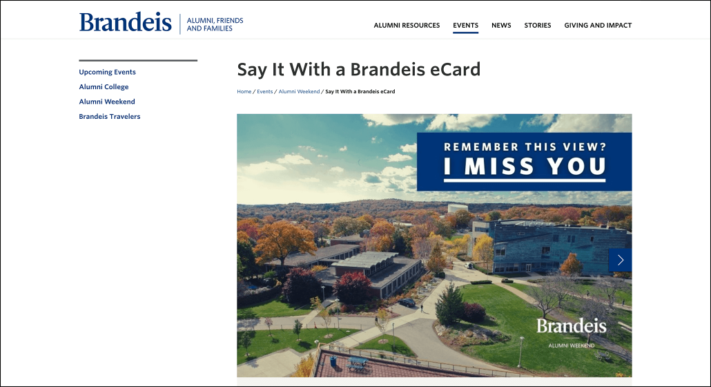
The Brandeis University alumni website gives alumni a variety of unique ways to engage with their community, including by sending branded eCards. Alumni can send the eCard pictured above to any of their friends and peers to invite them to the university’s upcoming alumni weekend.
9. University of Georgia
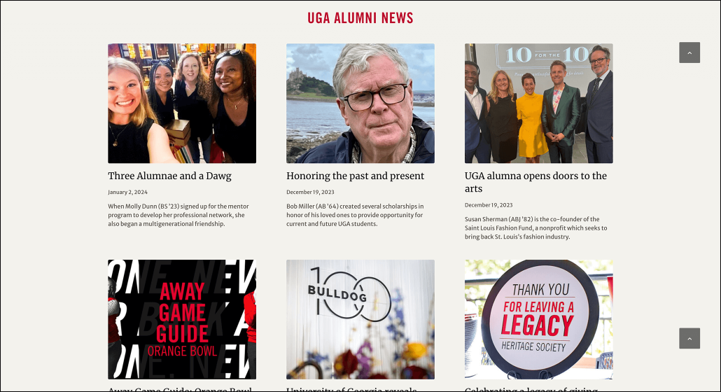
The University of Georgia (UGA)’s alumni website has a great alumni news section to keep all of its alumni up to date and in the know. This page includes alumni stories, news about new programs, and information about upcoming football games alumni can attend.
Alumni Website Design Tips
Ready to optimize your own website after seeing the possibilities? Keep these alumni website design tips in mind as you do so:
Anticipate website user intent
As mentioned earlier, the best alumni websites are built around users’ reasons for visiting. You can get into the details of your alumni’s unique motivations by analyzing site engagement metrics or sending out a quick survey to ask alumni directly what they want to see from your website.
However, there are also plenty of common motivations for visiting alumni websites that you can start with. For instance, many alumni will visit your website to:
- Connect with other alumni for networking purposes.
- Find professional development resources and other alumni benefits.
- Donate to your university or alumni association.
- Keep up to date on the latest alumni and university news.
- Find information about alumni events, reunions, and volunteer opportunities.
Make sure that your website not only addresses all of these needs but also makes it easy for users to find everything they’re looking for. Consider adding standout CTA buttons on your homepage that speak directly to alumni and lead them to pages they’re commonly searching for.
Improve UX
Next, take steps to provide a better user experience (UX) for the alumni who visit your website. UX refers to how easy it is for users to navigate your website and engage with content throughout their user journeys. Take the following steps to optimize your site’s user journeys:
- Improve navigation. There should be clear, straightforward user pathways that begin on your homepage and take visitors to your most important pages. Create these pathways by including several straightforward CTAs in your site’s header, navigation bar, and footer.
- Optimize for mobile. 57.8% of website traffic comes from mobile users. Ensure that alumni visiting your website on their phones don’t run into errors or have to jump through hoops to find information. Test your site’s mobile performance often and make any necessary adjustments.
- Remove visual clutter. You don’t want to overwhelm website visitors with too many images or text blocks on any given page. Limit clutter by prioritizing the most important visual elements on each page and removing the rest.
- Improve load speeds. If your website takes too long to load, alumni won’t be able to find what they’re looking for quickly. Improve load speeds by compressing images, setting visuals to lazy load, and minimizing HTTP requests.
If you’re not sure how to make some of these improvements, consider working with a web design firm. These experts can help you leverage your content management system (CMS) effectively and ensure your website follows all web design best practices.
Tell alumni stories
Highlighting high-achieving alumni on your website helps strengthen relationships and instill a sense of pride in the alumni who visit it. If you don’t have one already, consider adding a page or blog category to share the stories of specific alumni.
On this page, you can celebrate alumni by sharing news stories and one-on-one interviews. Include photos, videos, direct quotes, and testimonials to let alumni tell their stories in their own words. Mention their class year and other details about their time at your school to help readers connect with them. Consider including a quick form at the bottom of the page that alumni can fill out if they want to share their own story or nominate one of their peers.
Highlight matching gifts
Matching gift programs allow alumni to double their monetary gifts to your university at no additional cost. In these programs, companies commit to matching their employees’ donations to eligible schools and nonprofits at a 1:1 or even 2:1 ratio. This means that if an eligible donor gives a gift of $100, their company would provide an additional $100 donation for a total of $200 for your school.
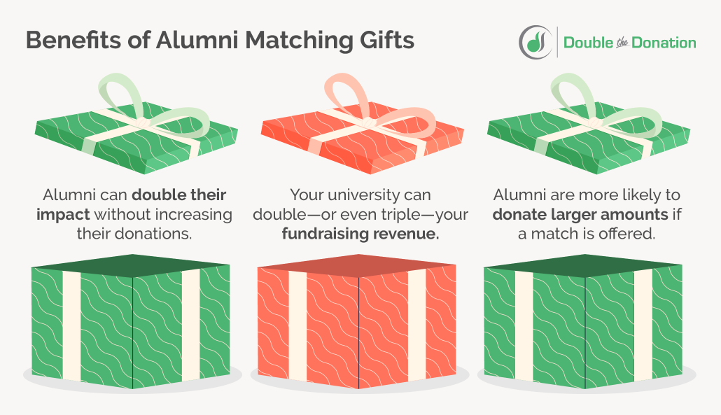
Matching gifts are an impactful opportunity that’s worth highlighting on your alumni website. Take a look at just a few of the ways spotlighting matching gifts on your website can benefit both alumni and your university:
- Alumni can double their impact without increasing their donations.
- Your university can double—or even triple—your fundraising revenue.
- Alumni are more likely to donate larger amounts if a match is offered.
To access these benefits, start by using a matching gift platform that enables alumni to request matching gifts right from your donation page. As they make a donation, they can quickly input the name of their employer and be automatically directed to eligibility and request information. With auto-submission functionality, you can simplify the process for alumni even further. Here’s how it works:
- A donor fills out your donation form as usual.
- They enter their work email address and check a box to submit a matching gift request automatically.
- The platform submits the request for them, and the donor’s work is done!
Once you have a system in place for simplifying donors’ match requests, take extra steps to promote matching gifts throughout your website. Add matching gifts to a Ways to Give page, write blog posts about the additional impact alumni can make, or create a video explaining how the process works. The more you highlight matching gifts across your alumni website, the higher chances you’ll have of doubling your donations.
More Resources for Designing Alumni Websites
With these examples and best practices in mind, you’ll be well-equipped to optimize your alumni website in ways that boost engagement, increase fundraising revenue, and help your alumni find what they’re looking for.
If you want to learn more about improving your website and how matching gifts can make a major difference for your university and alumni, check out these additional resources:
- How Matching Gift Appeals Can Fuel Alumni Engagement. Learn more about how matching gifts can help your university engage alumni and how you can promote matching gifts beyond your alumni website.
- The 22 Best College Websites (And What Makes Them Great). Need more web design inspiration? Check out this list of 22 additional college websites and learn why they’re so impactful on students.
- 10+ Higher Education Fundraising Conferences to Attend. Uncover key insights into higher education fundraising in this guide to the top conferences higher education professionals should attend.


