Creating Your Best Fundraising Flyer: 8 FAQs
As a nonprofit professional, you’re familiar with the important role fundraising plays in keeping your organization up and running. However, not every nonprofit recognizes the importance of marketing fundraisers with graphic design. Fundraising flyers are one of the easiest, most effective ways to promote your fundraiser.
Flyers are great nonprofit marketing tools to promote your fundraiser and maximize revenue. They also communicate important logistical details such as date and time in a succinct, readable format.
As you explore creating fundraising flyers, these topics will help you get started:
- What is subscription graphic design?
- Most-Asked Questions About Fundraising Flyers
- Additional Resources
Flyers also clearly lay out how and why you are raising money. Adding context as to why your organization needs to raise money and the ways you will be collecting it could motivate more people to participate. Let’s get started by learning how subscription graphic design can help you create effective flyers.
What is subscription graphic design?
 Choosing good graphic design software is just as important as choosing strong fundraising software, but making these important decisions can feel overwhelming. For many organizations, staff members simply don’t have the time to craft the perfect flyer in a design program. That’s where subscription-based graphic design services come into play.
Subscription graphic design services like Kwala offer a solution to nonprofit organizations that are pressed for time. This service connects your team with designers who understand the unique needs of nonprofits. Their deep understanding of the nonprofit landscape lends itself to custom graphic design products that address the challenges associated with the nonprofit sector.
With Kwala, you can create promotional materials and gear such as:
- Flyers
- T-shirt graphics
- Yard signs
- Stickers
- Table runners
- Postcards
Each of these items is fully customizable, and designers are committed to aligning designs with your mission and branding. The service offers unlimited requests and revisions to ensure you receive exactly what you want.
Most-Asked Questions About Fundraising Flyers
Why create fundraising flyers?
While many people might assume flyers are a thing of the past, this is far from reality. There are many reasons why fundraising flyers should be included in your marketing strategy, such as:
- Flyers are a low-cost marketing tool.
- They are a high-impact way to market.
- They are easy to create.
- Updating flyers in the event of changes is simple.
Flyers are a versatile and functional type of graphic design. They inform your supporters about important upcoming events and are easy to distribute, whether sent via email, posted in public areas, or distributed to your supporters.
What is the best way to make fundraising flyers?
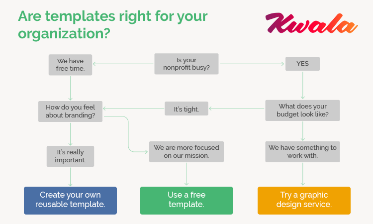
Simply put, the best way to create flyers varies for each organization. Depending on factors like team size, time availability, and budget, there is an approach to making flyers that works best for you. For example, a team with busy nonprofit professionals who still want quality graphic design materials can find success with a service like Kwala.
What graphic design tools should I use?
There are many different kinds of graphic design tools for nonprofits, but some are better and more affordable than others. When you’re looking for graphic design tools, keep in mind that flyers are simple and only require basic tools. You probably won’t need software with the longest list of capabilities but one that meets your unique
Canva
Canva is a graphic design program that is available online, so you won’t need to download any software. This platform has pre-made templates for just about any graphic design material you’ll need to create, whether that’s a social media post or a fundraising flyer. Canva’s software allows you to customize its templates so you can adjust fonts, colors, and images to match your branding.
As a nonprofit organization, you’re probably eligible for a free Canva Pro membership. You’ll have access to all of the templates, graphics, and project management tools the platform has to offer. You can also add other team members to the account for a collaborative graphic design process.
Pexels
Pexels is a service that features royalty-free media. While it is primarily a source for stock photos, the website also has royalty-free videos available. With images from Pexels, you can edit them as much as you like so that they match your branding and the theme of your fundraiser.
High-quality photos make your fundraising flyers shine. Pexels is a convenient source for images, especially if you don’t have the time or budget to take them yourself.
BeFunky
BeFunky has everything you need in a photo editor, including the ability to crop, recolor, and resize your photos. This tool is known for its one-click collage generator which creates cohesive collages from the photos you upload.
If you’re planning to integrate photos into your flyer designs, it’s best to work with an editing tool like BeFunky. While other design tools often have built-in photo editing tools, they tend to have limited capabilities. BeFunky, on the other hand, houses every common editing tool on one easy-to-use platform.
Should I try using templates?
Templates can work for any nonprofit, regardless of their design experience, because they streamline the entire process. For nonprofits with small teams, a limited budget, and a packed schedule, drag-and-drop templates are the best option. Templates give your organization the ability to make attractive templates without needing to spend time and money you don’t have on creating them.
While templates are a quick and affordable way to create flyers, they won’t be tailored to your organization and its branding. If you choose a popular free template, chances are other organizations have used the exact same one. Choosing templates you can customize sets your organization apart without demanding too much time from your busy schedule.
If you want unique templates but don’t have the time to create new flyers every time you have a fundraiser or event, consider creating your own templates. Set aside a chunk of time to develop a flyer template that’s consistent with your branding, complete with fields for important details like the fundraiser name, date, and time. Then, the next time you launch a fundraiser, all you’ll need to do is update the fields in the template!
What should I include in my fundraising flyer?
The main purpose of a fundraising flyer is to promote an event to your supporters. To ensure supporters have all the necessary information to attend, you’ll need to add some specific details to your flyers.
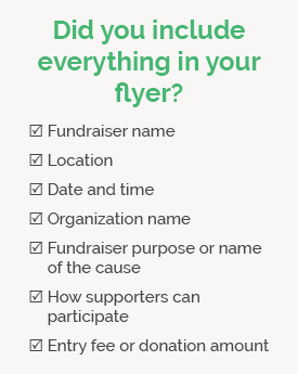
As you create your flyer, be sure to include the following information:
- Fundraiser name
- Location
- Date and time
- Organization name
- Fundraiser purpose or name of the cause
- How supporters can participate
- Entry fee or donation amount
Once you start building out flyers for various fundraisers, there may be additional information you need to include. For example, if your nonprofit hosts a picnic fundraiser, you should add a line noting that participants will need to bring their own blankets or chairs.
Flyers should contain the most important information your supporters need to participate in your fundraiser. Your goal should be to create a comprehensive source that covers all of your fundraiser’s bases. To maximize the marketing potential of your flyer and increase brand recognition, include your nonprofit’s logo on the page.
While you should strive to make a flyer that contains all relevant information, avoid bogging it down with too much text. Adding paragraphs of detailed information will make the flyer difficult to skim through, especially on social media. Ensure your supporters will actually read your flyers by sticking to short, bullet-point style lines of text rather than blocks of it.
What design strategies work in a fundraising flyer?
If you feel lost when it comes to graphic design, learning about basic graphic design strategies can help steer you in the right direction. These common strategies can help you leverage the full power of nonprofit graphic design in your communications. Generally, graphic design tips make for a clearer, more readable final product.
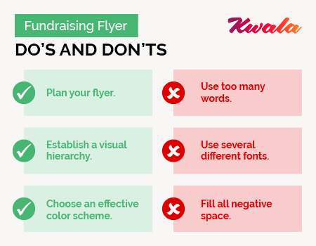
Create a plan.
Before you even open your graphic design software, plan out the flyer. Many designers prefer to use pen and paper to jot down or sketch their ideas quickly. Having a solid plan before you start designing prevents you from staring at a blank document until you feel inspired.
Start with a list of the information you’ll need to include in your flyer. Then, you can allow enough space for important fundraiser details. At this stage, it might help to note any ideas you have regarding images or graphics.
Next, begin to sketch a rough layout of your fundraising flyer. If drawing isn’t your strong suit, don’t panic — this step is just a tool for you to organize the basic elements of your flyer before you begin designing it. Once you feel satisfied with your sketch, start drafting the flyer in your graphic design software.
Establish a visual hierarchy.
Simply put, this strategy uses visual elements to signal what is most important about your design. For example, the name of the fundraiser should be the largest, followed by date and time, with less notable details being the smallest. Visual hierarchy directs the viewer’s eye to the most important piece of information first, subtly moving their gaze across the flyer.
It also ensures that viewers who give your flyer a cursory glance see the most important information. If they take anything away from the flyer, it will be whatever you’ve signaled is most important in your design.
There are many different ways to establish a visual hierarchy — namely through creating size differences, using contrasting colors, and organizing typography. Keep in mind that images and graphics catch the eye before any text will, so make these elements count!
Choose a color palette.
Design a color scheme that is effective, whether it is for a single flyer or your entire brand. Effective color pairings should contrast against each other and convey something about your brand. For example, green is associated with nature which makes it perfect for environmental organizations.
If you don’t know where to start when it comes to choosing a color scheme, try a color picker website to generate some combinations that will get you started.
What are some graphic design mistakes should I avoid?
Novice designers are bound to make some missteps at the beginning of their design journey. Unfortunately, mistakes aren’t always harmless, and they can sometimes lead to miscommunications between you and your supporters. Learning about common graphic design mistakes can keep you from making them yourself.
When creating your flyer, try to avoid:
- Using too many words: Keep your flyers as visual as possible. This means using photos, illustrations, and other graphics in place of large blocks of text. Limit text usage to bullet points or one-line phrases.
- Using several different fonts: Stick to one or two fonts per design. It’s easy to get excited and throw in three or four fonts that you love, but mismatched fonts are distracting for viewers. To build your branding, consider choosing a default font to use across all graphic design materials.
- Filling the entire page: Avoid filling every inch of the flyer with text, graphics, or images. Intentionally incorporate negative space, the blank space between graphic elements, into your design. Negative space directs viewers’ focus to the important parts of the flyer.
Some graphic design errors are tell-tale signs of an amateur designer. Keeping these mistakes in mind prevents you from creating flyers that aren’t useful for communicating information to your audience.
How can I save money on fundraising flyers?
While flyers are a low-cost option relative to other promotional materials, creating them on a tight budget can be difficult. One way to make a tight budget go further is to capitalize on matching gift programs and other corporate philanthropy initiatives. However, there are a few ways to cut down costs if you need a quicker solution.
Before you commit to purchasing graphic design software or registering for a paid membership, check for special deals extended to nonprofits. Many graphic design platforms offer free or reduced costs for their product as long as your organization meets their criteria. As you learn to navigate the software, browse the internet for free tutorials or courses so you can design more efficiently.
Printing costs can be high depending on the style of your flyers and how many copies you need. However, the world of social media marketing is growing faster than ever. If needed, your flyers can live totally online so you can cut out printing costs entirely.
Additional Resources
Flyers are an integral part of promoting fundraisers through nonprofit graphic design. With the dozens of graphic design tools available with just a few clicks, there is a way for every nonprofit to create stunning fundraising flyers. If graphic design is something you’re still mystified by, turning to a professional graphic design service is a great alternative to creating them yourself.
- 5 Steps to Create a Great Graphic Design Strategy. If you’ve researched graphic design strategy, chances are you got lost in jargon and technical language. These five steps clearly outline how you can improve your organization’s graphic design strategy.
- 5 Nonprofit Graphic Design FAQs to Help You Stand Out. Are you just dipping your toe into the world of nonprofit graphic design? Take a look at some of the common questions beginners ask to understand the basics, best practices, and how to find a graphic designer.
- 15 Best Nonprofit Graphic Design Examples. Feeling uninspired in your graphic design efforts? Check out these 15 top nonprofit graphic design examples to get some ideas for your next infographic or brochure.
